Design Tips for Non-Designers
This blog was originally published on Medium on Aug 30, 2016.
My coworker Dave Gerhardt approached me last week and asked if I had time to do a quick trade — at Drift we call it a drug deal. (A drug deal is a side deal that’s quick / easy and done outside of normal workload.)
Anyway — he needed a graphic for an article that he was writing. I needed him to look at some copy, so we sat down for 20 minutes to help each other out.
Since then I’ve realized a trend at every company I’ve worked for is that Marketing usually doesn’t have a designated designer. Marketers are forced to either build relationships with designers and ask for favors OR make design decisions themselves.
In light of that realization, I wanted to take a few minutes to pull together some design tips for marketers who don’t have a design resource at their side, and are looking for some extra information.
Here we go!
Color Theory 101
There’s a science to picking colors and it goes a little something like this:
Pick colors that are naturally harmonious and you’ll have the best results.
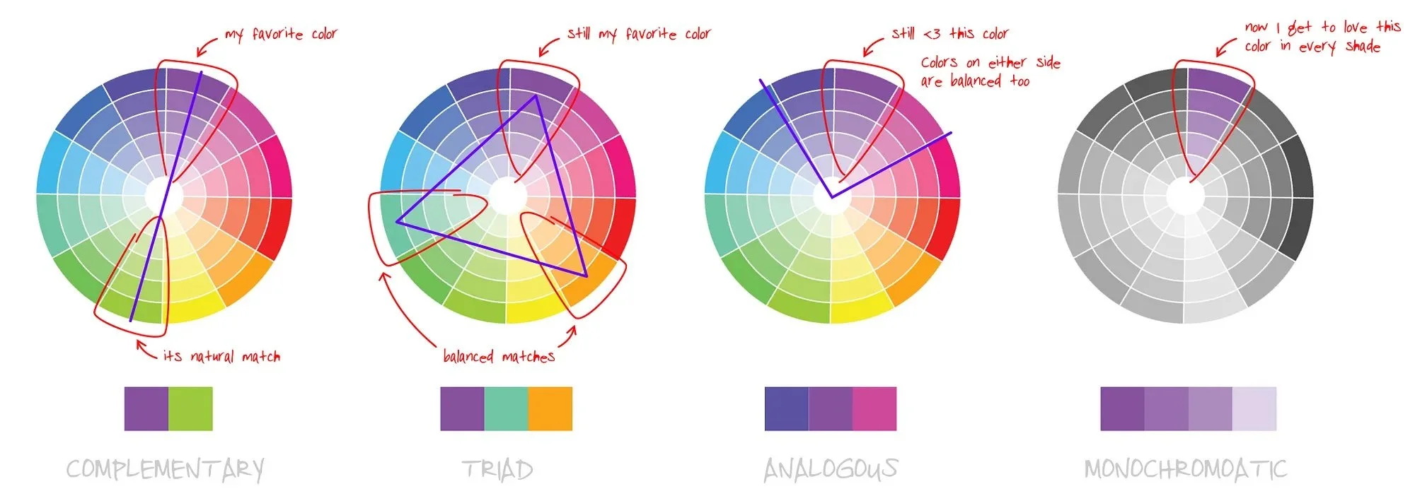
When you’re picking color combinations the choices are endless. Get out your trusty color wheel, and learn the 4 easy ways to pick colors:
Complementary / 2 colors. Pick your favorite color, then draw a line to color exactly opposite. Boom, you’ve got a match.
Triad / 3 colors. Feeling like you need a little more diversity? Start with your primary choice, and instead of drawing a line exactly opposite, draw an equilateral triangle. Now you have a balanced 3 color triad palette.
Analogous / 3 colors. Another good trick is to pick the color(s) on either side of the primary color you’ve picked. This is called an analogous palette.
Monochromatic. Pick your favorite color, and add variation by the shades you use together.
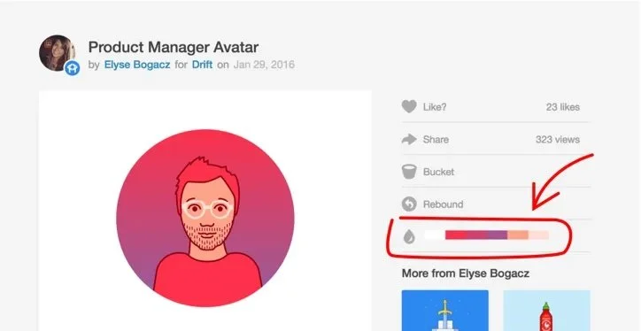
If you’re not into picking your own colors on a color wheel, there are plenty of palette generators out there. I often go to Dribbble to grab inspiration from their auto-generated palettes. It’s a nice way to see a set of colors together and figure out what you’re drawn to.
We are all professionals so I don’t have to explain why it’s okay to borrow from a color palette but it’s not okay to borrow the drawing or illustration itself without asking the creator. You’re a pro, and you already knew that.
Intro to Typefaces
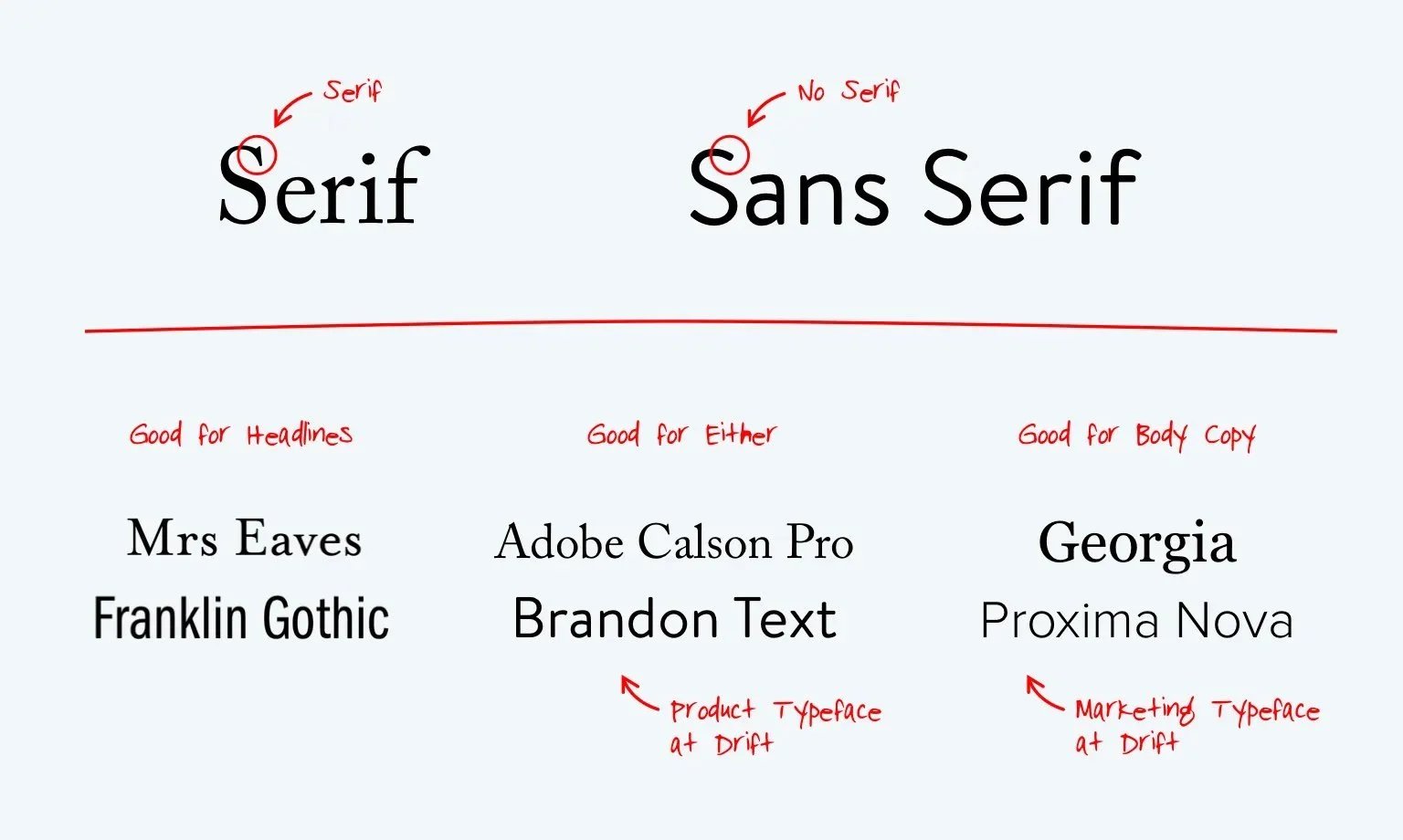
Different fonts are designed for different purposes. If you’re publishing on the web and your content is long form you want to pick fonts that were designed for digital reading, not one that you’d see in the finance section of a newspaper.
Try to only pick one or two at most. Generally, you want one for body copy, and maybe one more to use for CTAs or headlines.
There’s still lots of debate on the readability of Serif vs Sans Serif for digital. My personal opinion is that if most of your audience is using higher quality screens and your text size isn’t tiny… you can go either way.
Also — you’re reading this on Medium. Which is actually one of the best examples of content typeface pairings. They use Kievet and Charter.
If you’re interested in using premium typefaces for content, head over to Typekit or Google Fonts. Creative Market also has some lovely, affordable options.
Choosing Better Stock Photos
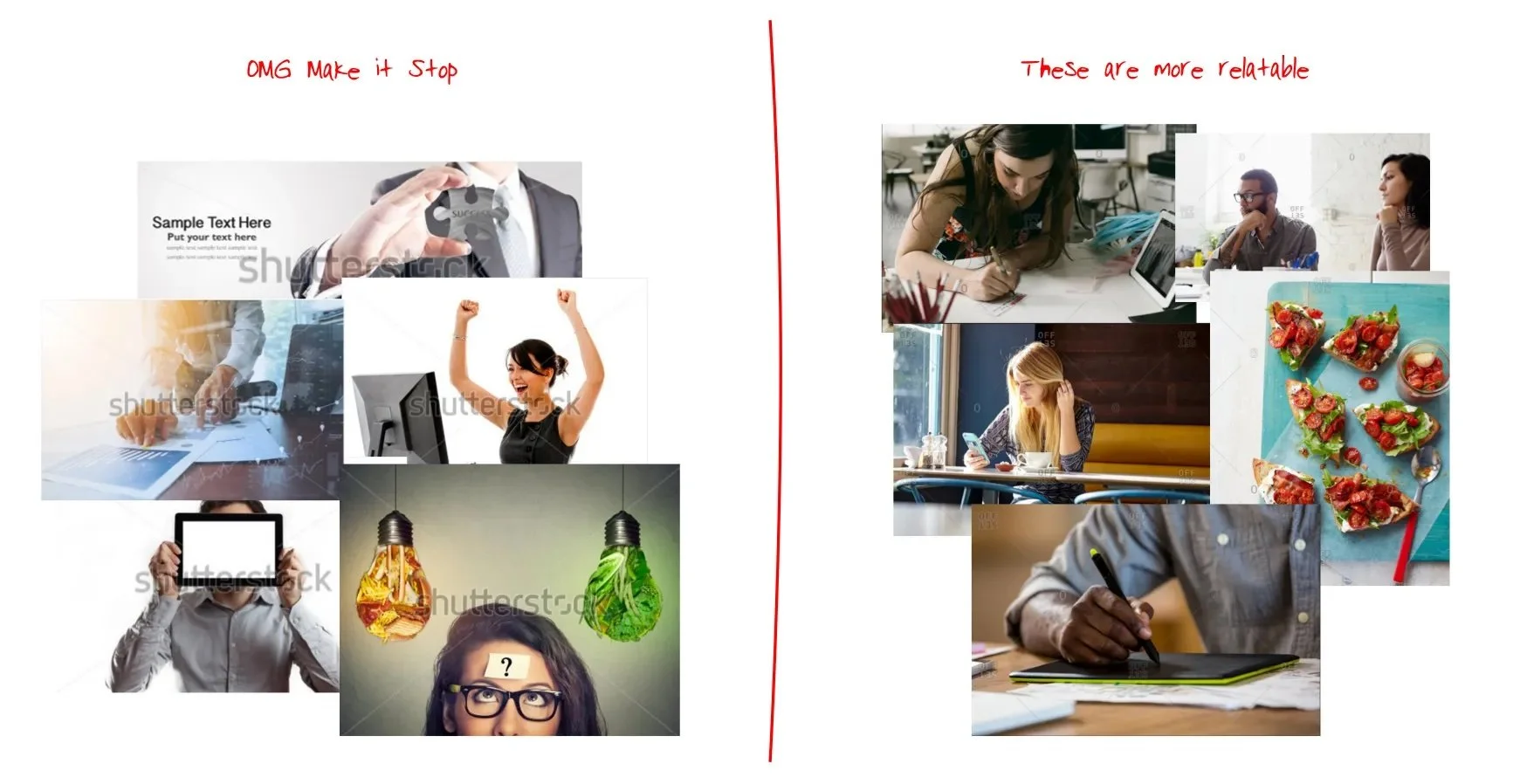
My biggest pet peeve as a content consumer is when the article I’m reading has a shit stock photo attached to it. It makes the content seem spammy or gimmicky.
Before you make a selection, ask yourself if the photo you are considering answers “yes” to both the following questions:
captures the topic of your article
is relatable
Most people stop at #1. This is an opportunity to do better and make marketing more personal with the visuals you choose.
More and more decent options for stock photos are becoming available every day, although I do agree sometimes you have to dig deep to find them. Here is a list of lovely (and mostly free) resources that I use often.
How to make your sh*t look great on screens.
Lastly, let’s talk about image quality. You put all this work in, lets make sure that your images are as polished as they can be!
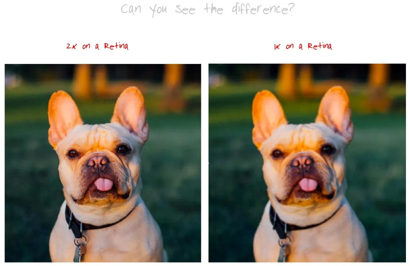
Retina screens make life a little harder because what looks great on your computer, might look fuzzy on a retina.
I find that 1200px is usually a pretty good width because it 1. Generally looks great on all screens and 2. Isn’t so massive it takes forever to load. If you can, try to use an image that is 2x as big as you’d like it to be and resize it to 50% in your content.
How easy this is really depends on the publishing platform you use. On platforms like Medium, life isn’t so hard because they auto size the image for you.
There we are. Those are the basics. You don’t need to be a designer to make great design choices, in fact I bet most people are more creative than they give themselves credit for.
If you guys liked (or didn’t like) this article, feel free to shoot me an email! (elysebogacz {atdrift.com) I’m also on twitter as elysebogacz.


