We Made The Decision To Add Six More Steps To Our Onboarding — And It Worked. Here’s Why.
This post was originally published on Medium on Aug 1, 2016.
We just finished implementing a 12 step onboarding.
“That’s WAY too many clicks.”
…is that what you’re thinking? You’re not wrong— that is a lot of clicks. But hear me out for one second.
I can’t tell you how many PMs and engineers have told me “that’s too many clicks” while we figure out how to chop and condense into something that’s actually less clear.
Here’s an ideology better than “keep the clicks low”:
Don’t make me think.
Aha! Now you’re back with me.
That’s was our approach with this new onboarding. We asked ourselves.. “How can we make sure each step (no matter how many there are) has such a low threshold of effort that users will fly through it?”
After spending some time getting our hands dirty — we were able to identify 3 major problems that we needed to correct, and how many steps we needed to do it.
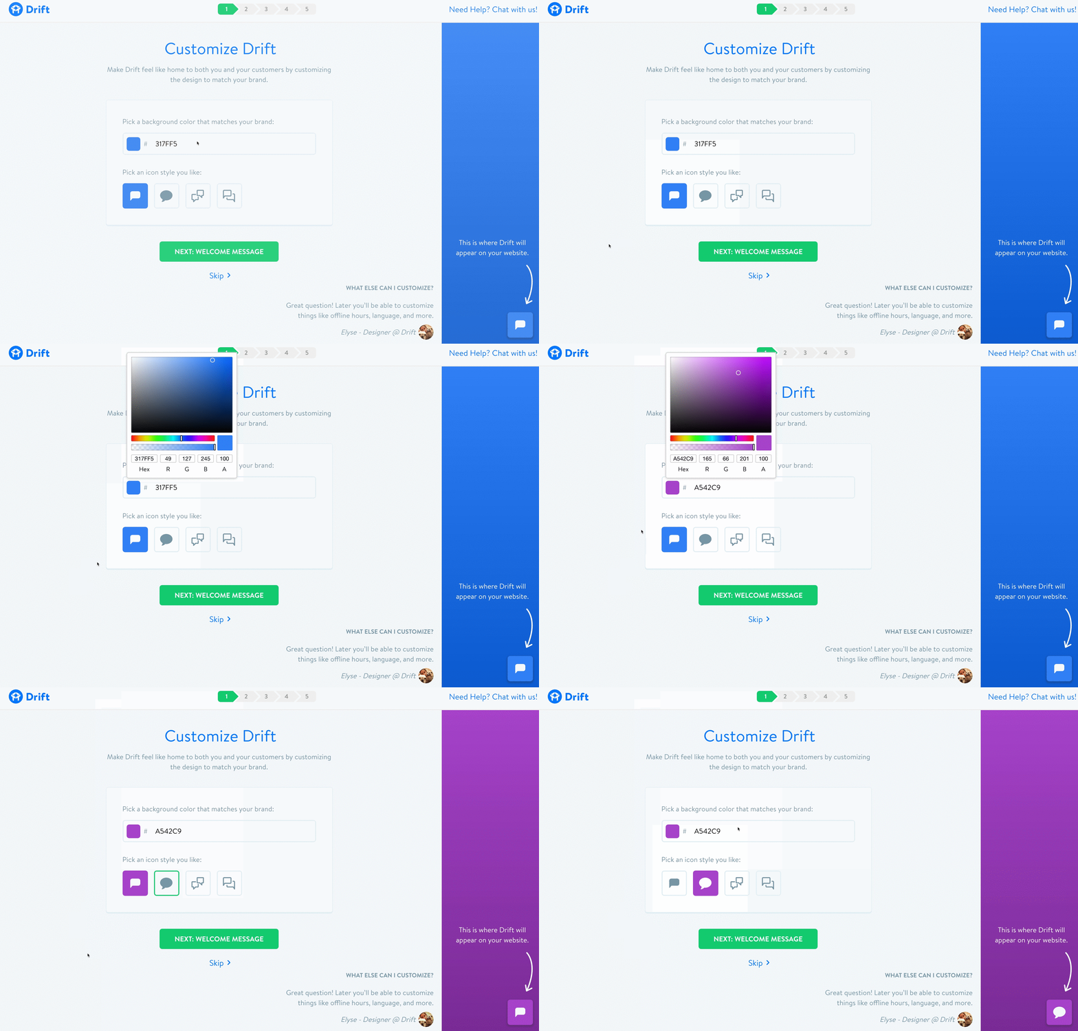
1. First and foremost — we needed to reduce the time to WOW.
Our old flow asked the user to do a lot of work and didn’t provide a WOW moment until the very end. By that point a good chunk of people had already fallen off.
The most important thing we needed was to give our users something to be excited about right from the get go. What’s more exciting than customizing something to mirror your brand? Boom. Let’s start there.
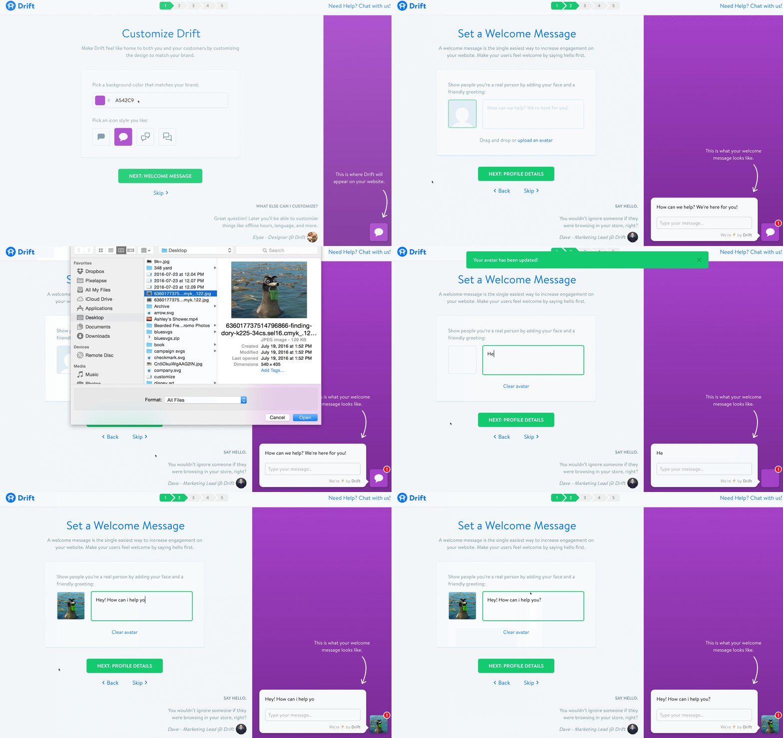
2. More focus on PEOPLE talking to PEOPLE.
The next problem we identified was that a majority of our customers weren’t adding an avatar or setting up a welcome message. Why? Because we weren’t asking them to.
Because we weren’t suggesting users do those 2 things — they weren’t. Which meant that some of our users weren’t getting the full Drift experience and therefore were missing out on some of the conversations they could be having.
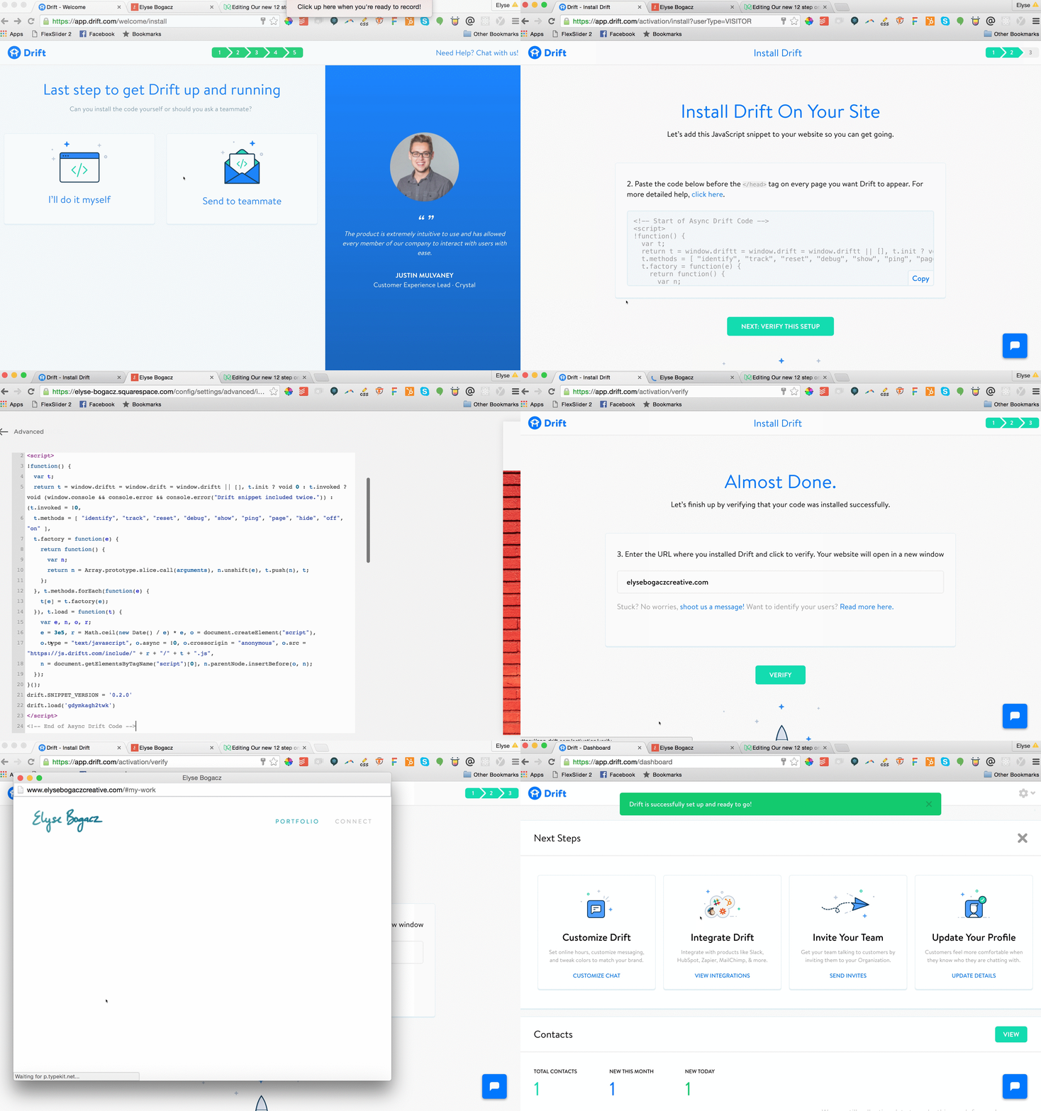
3. Last but major question: Soo.. who’s actually setting this up?
It became apparent to us pretty quickly that the people using and signing up for Drift might not be the person actually putting the code on their company’s website. Instead of dropping them into a screen with 15 technical things they could do and 5 different ways to install… let’s ask just one simple question:
Are you setting this up or is someone else?
You are? Cool —here are the install options. You got this, but we’re here if you need anything.
Someone else is? That’s cool too — here’s a place invite them.
Some of you might be like… “Ummm…. Elyse, the progress bar in your mocks say 5 steps, but this article says 12. Why you lyin’?” Great observation — there’s a set of screens within each “step” that adds up to 12.
Bucketing things by theme help keep the user from feeling as if there’s so much work they’ll never finish it! Here’s a chart of the things we themed and grouped:
Drift Onboarding’s final UX planning diagram.
There it is. That’s all the secret sauce. Making each step feel like an easy win for the user by only asking or solving for one thing at a time.
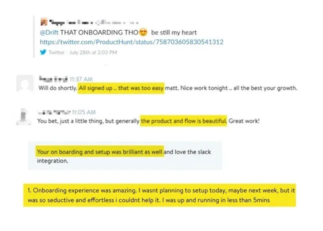
We shipped this new flow live the day before we launched our Drift bot on Product Hunt which put it through the ultimate stress test. I have to admit — I was a little anxious, but the reactions were great.
User response once this update hit production.
Awww gee you guys! 🙈
A designers work is never done. And I’m sure we’ll end up tearing this flow apart to optimize for something else eventually. In the meantime though— I hope this post is useful to anyone looking at their onboarding flow.
If you liked (or didn’t like) this post feel free to contact me! My email is elysebogacz@gmail.com. I’m also on twitter at elysebogacz.


